Relationships in the data…
For the last 10 years, I have been entering organizations with the goal of simplifying operations. Usually, the place I start is looking to find out what winning looks like in the numbers.
The Numbers…
The Metrics…
Data?

Ok, so not that Data 😉
Yes, from my perspective data is always the best place to start, but maybe not in the way you might be assuming.
When entering an org for the first time, I first ask for the most important data points or metrics for the business. Then ask, “What does good look like in these metrics?” I review the metrics and “see what I see” when comparing the metrics provided to this product or service’s typical KPIs.
- Compared to industry peers and norms, do this organization’s numbers measure up?
- How much space is there between the leaders and those that are lagging behind?
- How are the people in this organization using the metrics to gain insight and direction into the improvements that need to be made?
- How does the key clientele view the metrics and are they being shared during client meetings?
What relationships do they see in the data?
I have entered organizations that have reported the correct metrics, but did not understand the “why”. I have been a part of groups that knew why they reported the metrics but did not clearly know “what” to do with the data. Then the “how” to make changes with the what and why the data is being pulled also is a common problem.
I am no Peter Drucker, and you don’t have to be either to start simplifying the data, begin making connections between the data and what needs to happen next as an organization to improve, then make some simple processes to ensure the improvements stick.
In my experience, performance improvement starts with the front-line leaders and their understanding of the relationships between the data, processes, and performance.
So, I would start there. Being that I am no Peter Drucker, boiling this work into simple bullets that foster collaborative change works best for me. Here is a simple step-by-step list that may help to gain some initial traction when working with front-line leaders on building understanding….
- Find 2 – 3 key metrics that clearly show the outcome of the business process that drives the key product or service.
- Start having the front-line leaders report on these metrics each week.
- After 1 month of reporting, observation, and discussion around the metrics, help them make a simple process flow chart focussed on this particular business process.
- Using the simple process flow, Call out the 2 – 3 metrics in the process and show how they impact the overall business.
- Show the relationship in the process flow between performing well in this metric vs performing poorly and how the impact cascades throughout the process flow.
- (Note) use specific/real examples of how the metric has impacted the business along the process flow.
- Discuss and then write down new process changes on a second flow chart that would directly improve the key metrics, and as a result, improve the process and ultimately the business performance.
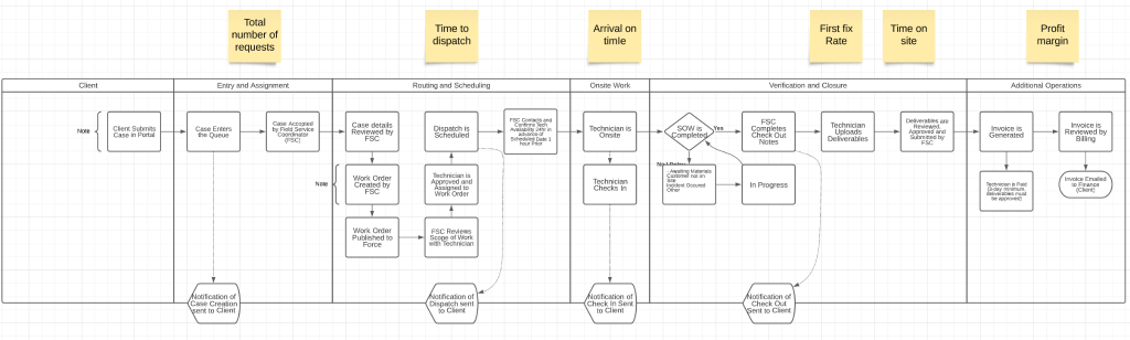
- Make a simple process document to pair with the updated process flow.
- Coach the front-line leaders on how to train the people on the new process using the new documentation.
- Go live.
- Measure those changes.
- Discuss the performance of the changes week over week.
- Very important to keep discussing the relationships between the metrics and people’s performance.
- Tweak.
- Repeat the above as lessons are learned.
As I said, I try to always make things as simple as I can. Two reasons drive me in doing this.
- If a process or practice is simple, people are more likely to actually use it and then stick with it. So, improvements continue.
- Most of the time, simple processes are easier to understand, also shorter, and therefore faster to do.
So, simple processes based on key metrics drive lasting improvement when the front-line leaders participate in making them, calling on their understanding of the relationships between what the data is telling them, and why they should change.
The fun part comes as you work together on how the changes presented will actually happen and map out the new processes together.
